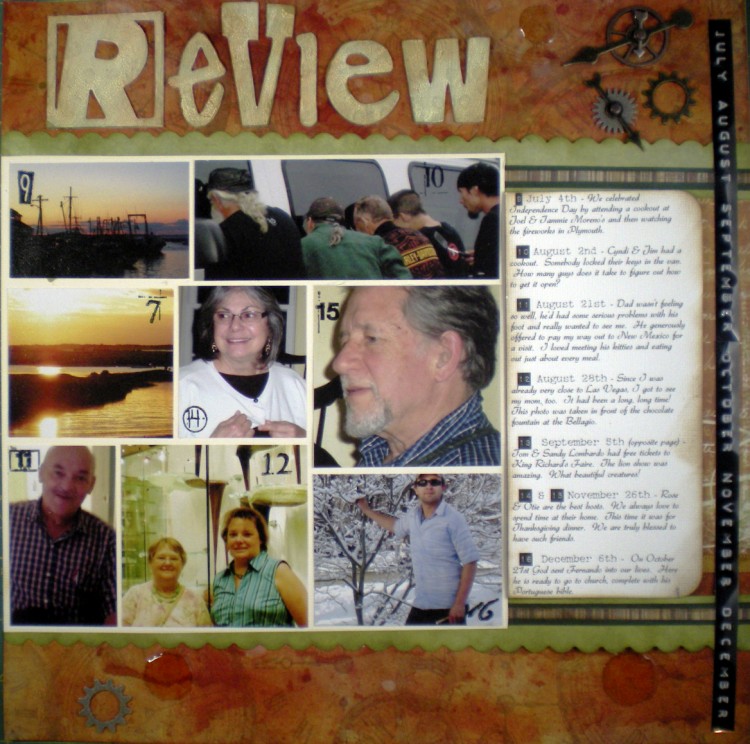
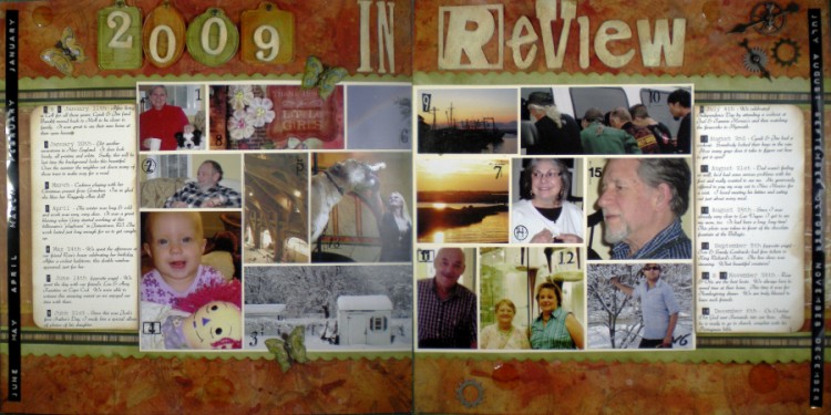
So, we’ve been time traveling this week, but hold onto your hats, cuz now were zooming ahead to the end of 2009.
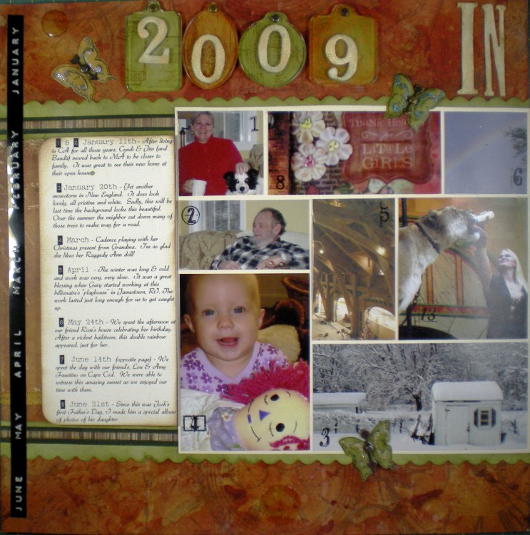
At that time I was frustrated at the thought of trying to get caught up in my scrapbooking. Then I read a great article about doing “Year in Review” layouts. Brilliant! By doing this you can get an entire year’s high points onto one spread, get your thoughts down while you’re at it, and have those as reminders whenever you do the individual layouts.
The first and toughest step was to choose just the high points of the year, and just one or two photos for each. I finally settled on 16.
The title letters are Grungeboard Alphas, painted with Scattered Straw Distress Crackle Paint and inked with Vintage Photo Distress ink. The numbers were glued onto Tim Holtz Idea-Ology Fragments which had been backed with pattern papers.
I had a lot of fun, playing with the theme of “time.” I used Glossy Accents in a few spots to try to get the look of watch crystals. (Dunno that that succeeded too well.) I wrote “Tempus Fugit” on the wings of all the butterflies, and used Tim Holtz Idea Ology Game Spinners (that look like clock hands) for their bodies. The Sprocket Gears make one think of clock movements.
The Dymo Labeler gives a great, edgy look. I’ve gotta remember to pull that out more often!
To number the photos I used the Messy Dates clear stamps (Autumn Leaves) with Black StazOn Permanent Ink.
(My apologies to the author of the “year in review” article who inspired these pages. I think I snagged your idea AND scraplifted your layout. I cannot find the original article in order to give proper credit. If anyone recognizes this layout, please let me know where you saw it so I can give credit where credit is due.)
